

Screens come in countless shapes and sizes, from compact phones to wide desktop monitors and folding displays. An application that looks sharp on one device but breaks on another quickly loses users.
Building something that adapts gracefully across all these formats has become a core expectation rather than a luxury. Understanding the principles behind this adaptability helps clarify why some apps feel effortless while others frustrate at every turn.
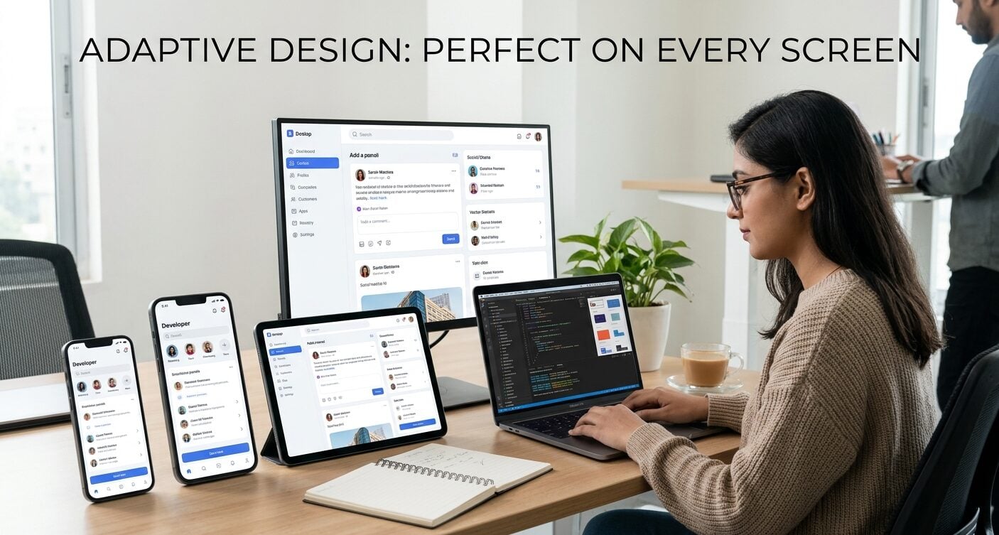
Why Screen Adaptability Shapes User Experience?
The first impression an application makes often depends on how naturally it fits the device in hand. When buttons sit within easy reach, text remains readable without pinching, and images scale cleanly, people engage longer and return more often. A cluttered or misaligned interface, on the other hand, signals neglect and pushes users toward alternatives.
Adaptability also carries practical weight for accessibility. Individuals rely on different font sizes, orientations, and assistive tools, and a flexible layout accommodates these needs without separate versions.
This inclusivity widens the potential audience and reflects a thoughtful design approach. The payoff shows in retention numbers, where seamless cross-device performance correlates strongly with loyalty.
| Adaptability Factor | Impact on Users | Business Outcome |
| Readable, scalable text | Less strain, no pinching to zoom | Longer session times |
| Reachable controls | Comfortable one-handed use | Higher engagement |
| Clean image scaling | Professional first impression | Stronger brand trust |
| Flexible accessibility support | Wider range of users served | Broader audience reach |
| Consistent cross-device feel | Smooth transitions between devices | Improved retention and loyalty |
Taken together, these factors show that adaptability is never just a technical detail but a direct driver of how people perceive and value an app.
Each small improvement in fit and comfort compounds into measurable gains in engagement, trust, and long-term loyalty.
Core Design Principles Behind Flexible Interfaces
Several foundational ideas determine whether an app bends comfortably to its environment or snaps under pressure.
Responsive design remains the backbone, allowing content to rearrange itself based on available space rather than forcing a fixed structure. Fluid grids and relative units replace rigid pixel measurements, so elements expand or contract in proportion to the viewport.
Beyond layout mechanics, developers prioritize touch-friendly targets and readable typography that scales sensibly. Consistency across breakpoints matters too, because jarring shifts between phone and tablet views erode trust.
The most effective interfaces feel like a single coherent product regardless of the device displaying them. The following principles consistently appear in applications that handle varied screens with ease:
- Fluid layouts that resize proportionally instead of relying on fixed widths.
- Scalable assets such as vector graphics that stay crisp at any resolution.
- Adaptive navigation that shifts between menus and bars depending on space.
- Performance budgets that keep load times low even on slower connections.
None of these principles works in isolation; their strength comes from how well they combine. Applied together, they create interfaces that feel intentional and dependable on every device.
Testing Across Devices and Real Conditions
Design choices only prove themselves through rigorous testing. Emulators offer a starting point, yet nothing replaces examining an app on physical hardware with real network conditions.
Variations in processing power, screen density, and operating system behavior reveal issues that controlled environments often hide. Thorough testing across a representative range of devices catches these problems before they reach the public.
A useful way to track coverage during this phase is to map how the interface behaves at each major size category. The table below outlines common considerations across typical screen groups.
| Screen Category | Primary Concern | Design Focus |
| Small phones | Limited width | Single-column flow |
| Large phones | Reachability | Thumb-friendly zones |
| Tablets | Empty space | Multi-pane layouts |
| Desktops | Wide viewports | Balanced spacing |
Among industries where cross-device reliability carries real stakes, gaming and entertainment set a high bar for smooth performance.
Those exploring the NV casino download app often expect the same fluid card games, slot reels, and live tables whether they open the lobby on a phone during a commute or on a tablet at home.
Consistent loading, crisp visuals, and responsive controls across these casino experiences demonstrate how much device-aware engineering shapes satisfaction in demanding, interaction-heavy applications.
Performance Factors That Keep Apps Smooth
A visually adaptable interface still disappoints if it stutters or drains the battery. Efficient code, optimized media, and smart caching all contribute to the sense that an app simply works.
Lightweight assets load faster on modest hardware, while thoughtful memory management prevents crashes during extended sessions. These invisible efforts often distinguish a polished product from a merely functional one.
Network variability adds another layer of complexity. Applications that anticipate slow or intermittent connections, offering offline fallbacks or progressive loading, maintain usability where competitors stall. Prioritizing what loads first ensures that core functions appear quickly, even when the rest arrives gradually.
Synthesizing the Elements of Device-Agnostic Design
An application that performs well on any screen results from deliberate choices rather than coincidence. Flexible layouts, scalable assets, and adaptive navigation form the visible foundation, while careful testing and performance tuning support the experience beneath the surface.
When these elements align, the app feels natural on a phone, a tablet, or a desktop without obvious compromise. That seamless quality reflects a design philosophy that treats every user and every device as worthy of equal attention, which remains the clearest marker of thoughtful modern development.
