

A cause-and-effect Diagram is an indispensable tool if you want to reach the root cause of any problem. The illustration is extremely useful for getting a clear image of possible causes, identifying patterns, and getting better solutions for challenges.
An all-encompassing idea about this chart can be beneficial for students, professionals, and project members to combat difficulties with clarity.
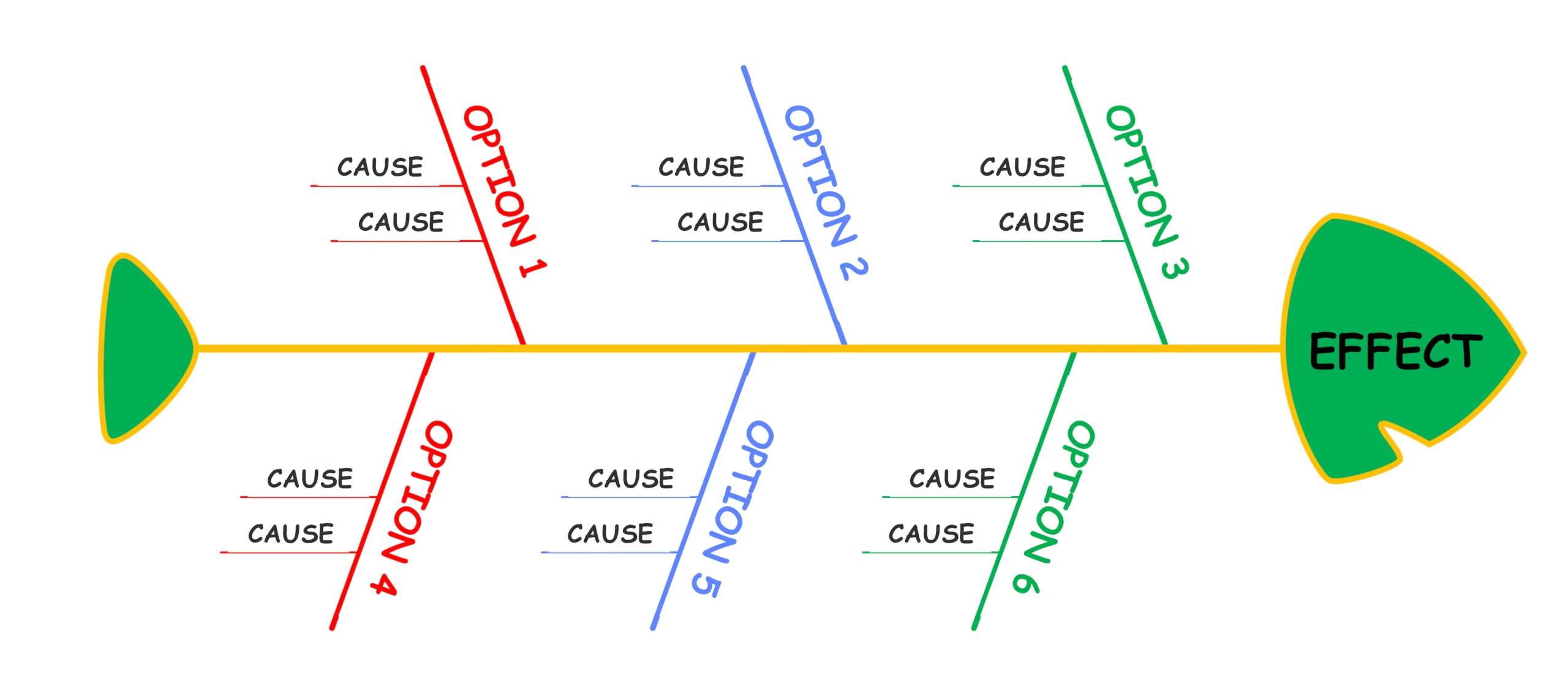
A lot of students and experts count on reliable software providers to get access to software that helps create illustrations like Fishbone.
A cause and effect diagram tutorial from trusted sources can provide simple explanations and useful guidance for beginners. Go through this guide to gain an idea about the key things readers should know about their uses and benefits.
1. The Simple Truth Behind the Illustration
A fishbone diagram, also known as a cause-and-effect or Ishikawa diagram, helps users understand why a particular issue occurred.
To understand the reasons beyond it, one needs to reach the connection between the issue and the different influencing factors. Teams frequently use this illustration when a challenge becomes harder to solve through simple discussion or observation.
The diagram is useful for resolving difficulties like recurring software bugs, employee attrition, or unsatisfactory sales performance.
These challenges can only be solved when you trace the underlying cause behind them. Also, the illustrations and the patterns understood from it help look beyond the foremost challenge, which has been identified at the beginning. However, for this, one needs to know the crucial factors associated with this illustration.
Crucial Elements of a Fishbone Diagram
Here are the main parts that make up this illustration:
- The problem statement: the main issue you write at the head of the fishbone.
- Major categories: broad groups like people, process, materials, and equipment.
- Sub-causes: smaller reasons that fall under each of these categories.
- The spine: the center line that connects everything back to the problem.
- Branches: the lines that link related causes to each category.
2. The Obstacles This Illustration Helps Solve
Fishbone diagrams can be used to resolve challenges like overlapping concepts, miscommunication, and making wrong decisions.
Through this illustration, leaders in commercial setups resolve challenges like low product quality, deteriorating customer service, and unclear workflows. In this way, charts like this help schools, businesses, and organizations get to the bottom of such daily struggles.
When you reach the root cause of any hurdle, the issue gets almost solved. So, the illustration works well for tracing concerns like employee burnout, equipment failure, or communication gaps between departments. Once the reasons are laid out clearly, teams can focus their energy on fixes that actually matter.
3. Common Users of This Illustration
Different professionals use cause-and-effect diagrams when they need to understand problems more carefully. Managers, engineers, teachers, and project teams frequently use this tool during analysis and planning. The simple format allows people with different backgrounds to contribute valuable ideas.
Teams can use these illustrations to collect viewpoints and create a shared understanding of challenges. The visual structure helps everyone follow discussions without feeling confused by complicated information.
This makes teamwork easier when people need to identify underlying reasons and plan improvements together.
4. Real-Life Applications of This Chart
Ishikawa diagrams are useful in multiple real situations where challenges need careful investigation. Companies may use them to review service issues, workflow delays, or repeated operational challenges. They also help teams understand factors that affect results in different environments.
The American Society for Quality (ASQ) has come to the conclusion that the root cause analysis technique allows enterprises to find out the true reasons for obstacles rather than just addressing the visible symptoms.
For example, companies can examine customers’ complaints and find out what is behind the poor service. Additionally, the production staff can study the production problems from various angles.
5. Common Mistakes That Reduce the Chart’s Effectiveness
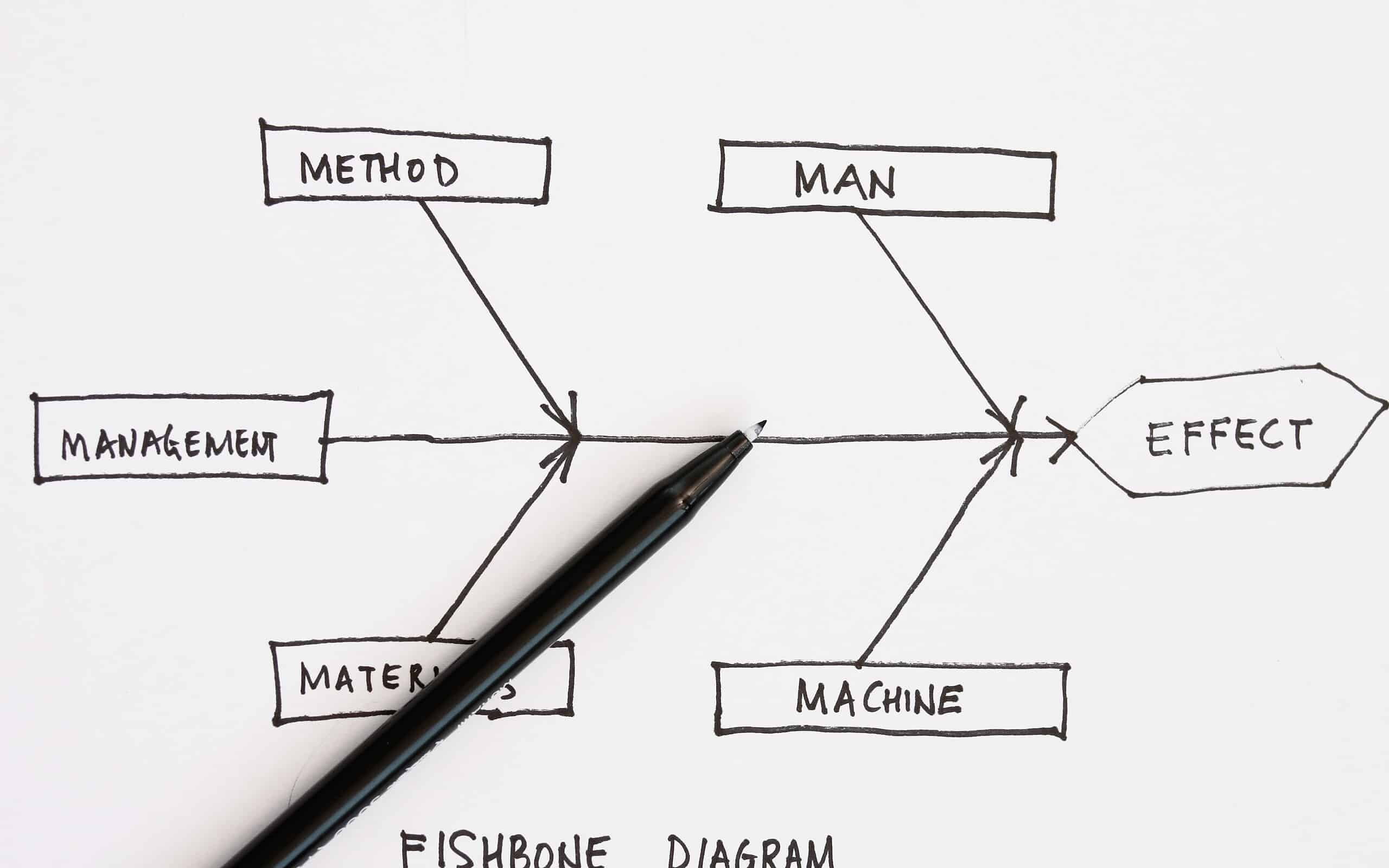
If you want to create a proper fishbone diagram, you need to be careful about the common mistakes people make.
Some focus only on obvious problems and ignore deeper reasons behind the situation. Mistakes like this can prevent teams from finding solutions that create lasting improvements.
Then how to resolve this issue? A balanced approach will help you include different opinions and review all possible causes accurately.
Don’t add unnecessary information to keep the chart as clear, focused, and easier for everyone to understand. Make sure to review regularly to ensure the identified reasons match the actual difficulty.
6. Pro Tips to Create a More Useful Fishbone Diagram
Just filling in boxes and branches with random ideas isn’t really enough. The small choices you make while building it can turn a messy chart into something people actually use.
A lot of folks stop right after the basic structure and miss out on making it sharper and more useful. So here are a few tips that can help:
Tips to Create an Illustration That Truly Works
- Keep asking “why” for each cause until you hit the real root.
- Don’t mix up symptoms with actual reasons on the same branch.
- Stick to a few strong reasons per category instead of piling on weak ones.
- Check your causes against real data before you treat them as facts.
- Go back to the diagram after fixes are in place to see if they worked.
- Try color coding so the most urgent reasons stand out at a glance.
7. The Role of This Chart in Supporting Better Decisions
Ishikawa diagrams help make decisions based on organized information instead of assumptions. They allow people to examine complications from different angles before selecting possible solutions. This makes the decision-making process more thoughtful and effective for various situations.
The illustration supports better planning because teams can understand challenges before taking action. It creates a common reference point that keeps everyone focused on the same issue. Through this approach, organizations can develop solutions that address challenges more completely.
| Aspect | Key Information |
| Main Purpose | Helps identify possible reasons behind a problem and understand their connection. |
| Best Used For | Analyzing repeated issues, improving processes, and finding areas that need attention. |
| Main Users | Teams, managers, engineers, educators, and professionals involved in problem-solving. |
| How It Helps | Organizes thoughts, encourages deeper analysis, and supports better solution planning. |
| Common Areas of Use | Quality improvement, customer service, workflow issues, and operational challenges. |
| Key Success Factor | Focus on accurate causes, team input, and clear problem statements for better results. |
This quick overview highlights the main purpose and value of these illustrations. The above table helps understand how this tool supports better problem analysis and decision-making.
Cause-and-effect diagrams help people understand problems clearly by connecting possible reasons with practical solutions.
A cause and effect diagram tutorial can help beginners learn this tool and use it for better problem analysis. So, don’t wait; explore trusted software providers to learn the process and create effective illustrations with confidence.
