Gone are the days that businesses used to fight for spots to put up a billboard for their brands. The business world has become very dynamic: all to the advantage of business owners. If you do some research, you will find that most of the businesses, big or small, have websites. The world is going mobile. 60 percent of Google searches originate from mobile devices. What does this tell you? Most of your customers and potential ones will be looking for you using mobile phones and tablets in the buses on their way to work. You should be proactive. Your website should be mobile friendly to give them a good user experience when they visit your site. They are likely to stay longer which translates to more conversions and sales. How about you get smarter than your competition and incorporate online phone cards like NobelApp to better engage your customers? With such an app and the following tips on how to make your website mobile friendly, you are bound to win.
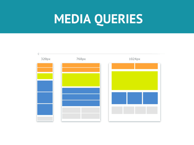
1. Make use of media queries
How do they work? First of all, you need to understand that ‘media’ in this case refers to the type of content that you produce for your audience. With media queries, you will be able to inquire about the kind of mobile device that is being used by the customer and in turn guide you in displaying content that works best with that particular device.
2. Employ responsive themes
Using responsive themes will go a long way in ensuring that the content you display for the users is of high quality. It is important to note that if a theme is working for your desktop website, it does not necessarily mean that it is ideal for your mobile site. It is something that most business owners tend to pay a blind eye to. You cannot afford to ignore this!
3. Optimize image size
Well, the image size is also a culprit in making mobile websites loading speed painfully slow. And do you know what happens when it takes more than four seconds for a page to load? The user will exit. To avoid that, consider optimizing the image size to make your website mobile friendly. Use smaller images that appear clear and leave the bigger ones with terrible pixel alignment for desktop websites.

4. Avoid Flash
Flash is just not meant for mobile devices. You should consider ditching it all the same. If your site works with Flash, it is essential that you understand that it does not work with mobile devices. Instead, you should migrate to technologies that are compatible such as HTML.
5. Apply standard fonts
Some fonts are only available on desktops. Yes, they may be appealing, but they may not be able to work for you when it comes to mobile devices. Remember that the devices may not have the fonts, and the user may be forced to download the particular font for them to be able to view your content. More so, the readability of your font is also detrimental.
Making your website mobile friendly is aimed at making your audience user experience great. It is something that you should ignore.